Blog
Blogs posts about the latest landing page tools, guides and startup resources.
How I Built 1 Product of the Day on Product Hunt
Written by: Yucel Faruk Sahan
Sun Jun 20
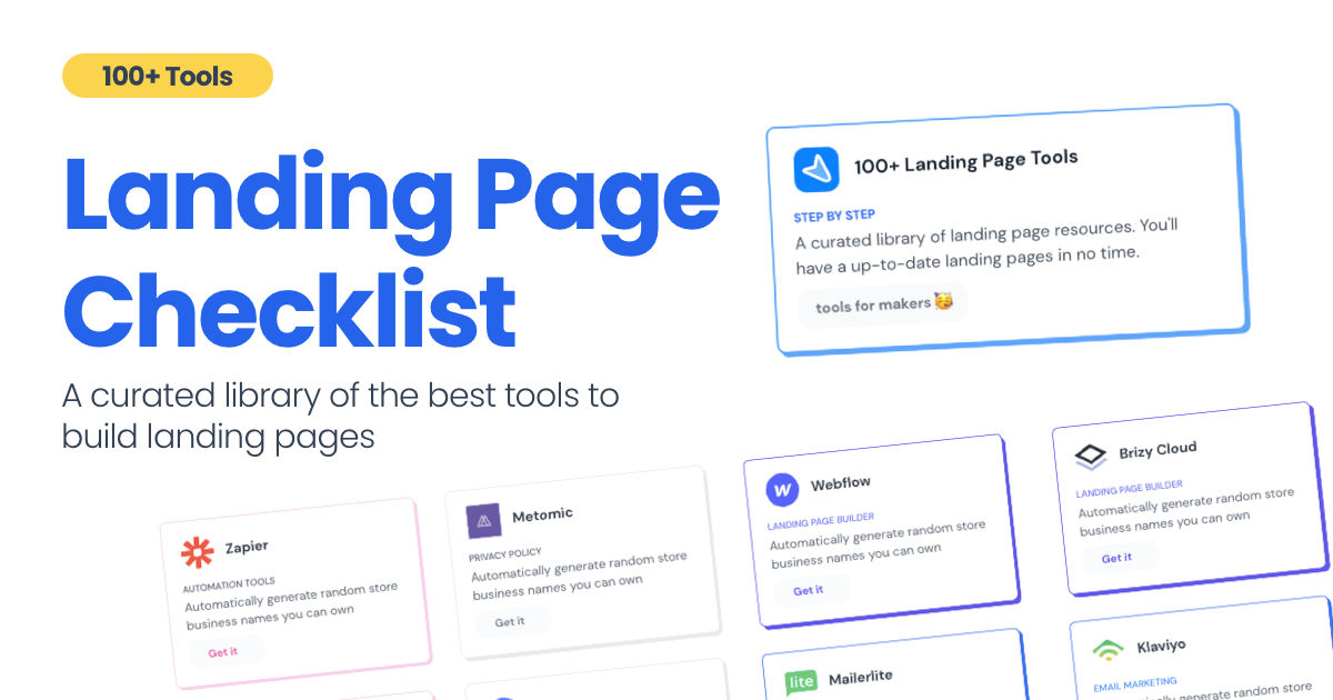
I will do my best to explain how I built Landing Page Checklist as simple as it is. It took me 3 weeks to build and launch it. I did not work on it for more than 3 hours a day. I worked mostly on weekends.
In this article, I will tell you about my weekend project, that I started with the energy of building something. It ended up #1 Product of the Day, #2 Product of the Week, and #4 Product of the Month on Product Hunt!
It is kind of a long story; if you want to see which tools I used to build Landing Page Checklist just scroll at the bottom of the page 👇🏻
As a matter of fact, it all started with the startups-investments blog; Startup Bulletin, that I started writing in 2018. No, don’t worry, I won’t be going that far behind.
The twitter account where I shared the blog posts of this newsletter was inactive for a looong time. I was holding this Twitter account since 2009, I couldn’t bear to destroy it. At the same time, I was thinking how to evaluate this account.
So I wanted to do something and started to look for a weekend project idea.
Weekend Project: Business Name Generator
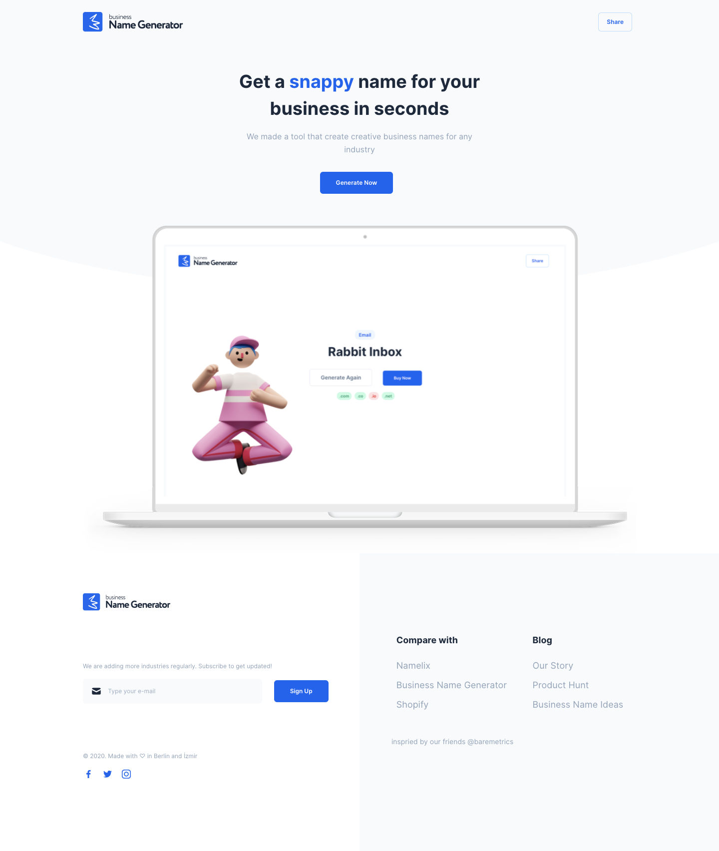
On the other hand, I and my dear friend Barash started working on a weekend project just to keep us updated. We knew we would learn better and faster by building stuff.
The idea was simple. It was going to be a “Startup Name Generator” The tool was going to generate random names for startups. We named it “Business Name Generator” after some market research in terms of SEO purposes to rank higher someday.
Barash is a backend developer, and he does not enjoy working on the frontend side. He encouraged me to work on the frontend code. He told me to look at Chakra UI and Tailwind CSS.
It was the first time I have heard about Tailwind CSS.
Before this project, I made some designs for mobile-web app projects on Sketch and shared them with my fellow coders via Zeplin. I could understand an HTML-CSS or React code when I see it but coding on my own! Honestly, I did not believe myself at that time but I followed Barash’s advice.
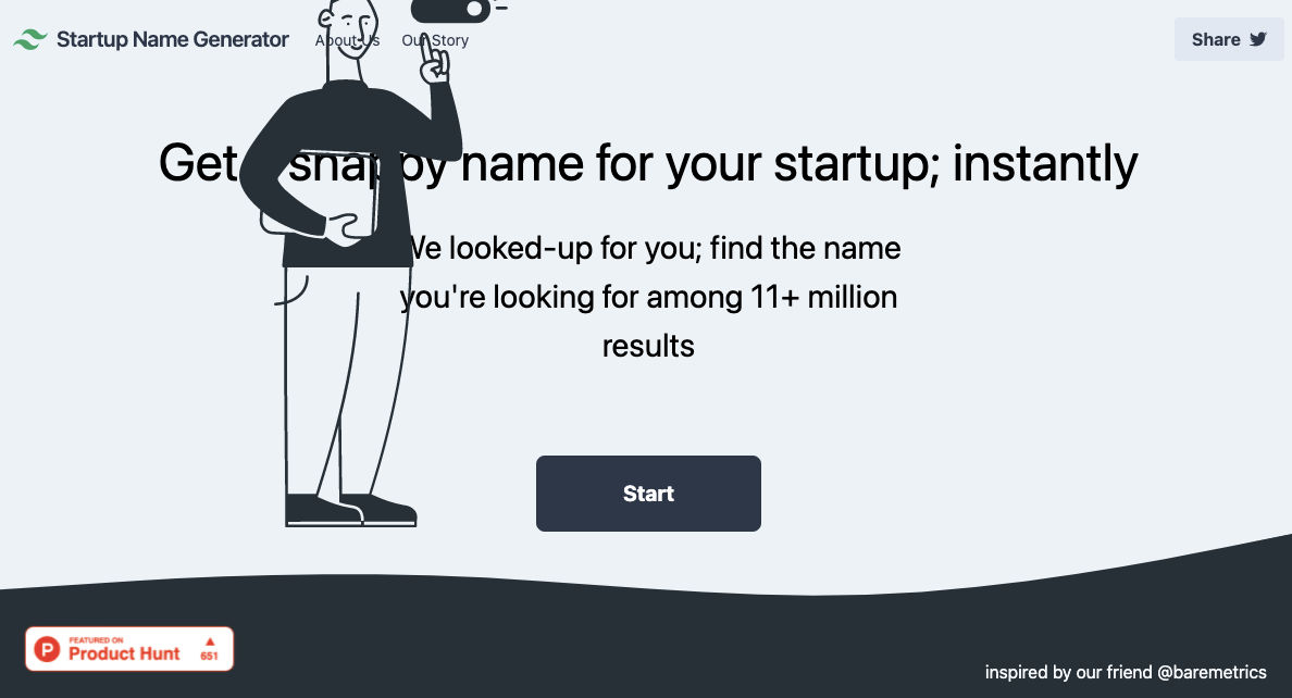
I started to work on the home page but it was not anywhere near responsive design. Here is how it looked then
Then something happened! I saw a product on Product Hunt that was made for me. *Specifically for me!*ß A Website builder that lets you choose pre-made components on web (like Elementor) and gives you clean Tailwind CSS code. It was amazing.
I purchased it immediately and was amazed at how easy to use it was. The best thing; it does not give you index.html file only. It gives you all the necessary files to make it work! Such as;
- postcss.config.js
- README.md
- package.json
- tailwind.config.js and other things.
This feature is for those who are non-technical people 👏🏻👏🏻👏🏻
Tailwind.build; which is Github Desktop now, allows you to create and export projects for free (with limited features). You can try it by visiting theirwebsite.
After downloading the project, you can open this file on Visual Studio (or some other text editors) and edit the text and images you desire. You can host this simple HTML file whenever you want.
One of the easiest ways to host your landing page is to do it via Github or a similar platform:
- Export your project via Shuffle
- Edit your website content
- Open a Github/Gitlab/Bitbucket account
- Upload your project folder to Github
- Connect your Github account with Vercel (or another platform below)
- Let them lead you step by step.
That’s it. If you learn how to send (I say push now 😎 ) your code to Github via Shuffle you’ll do it super fast easy.
Speaking of; here are some hosting and serverless backend services for web applications and static websites for you host your landing pages for FREE!
I host landingpage.fyi on Vercel but all is fine. You can choose any platform below with peace in mind.
After you connect your project/repo to Vercel you don’t have to do anything on Vercel. Once you update your code via Github Desktop, Vercel will immediately update your live website. That’s amazing!
While I was messing around with tailwind.build, another similar product came out: Tails. Although it is more pleasing to the eye it was not as good tailwind.build in terms of mobile-friendliness. They got very nice-looking components so I couldn’t help myself. I switched to Tails :)
Tails offers hundreds of well-designed components that can be used. As I mentioned before some of the components were looking bad on mobile devices but this defect led me to learn Tailwind CSS better and better.
Unlike Shuffle, Tails does not include files when you export such as config.js, main.js, README.md. It just gives you the HTML code. Suffle.dev is a bit ahead in this regard and with mobile-friendly blocks if you ask me. Of course, I took advantage of both.
creativebusinessnames.co is currently not active but I will leave deployment link if you want to see it
I have watched Adam Wathan’s YouTube tutorials checked Tailwind’s Official documentations daily these helped me to grasp better but I couldn’t have done it without Tails and Shuffle. These tools helped me to build landing pages on my own. It was not a good idea for me to start from scratch.
That’s the story of how I stepped into Tailwind CSS world. I couldn’t tell you how I built Landing Page Checklist without telling the story behind ¯_(ツ)_/¯ I did not plan it to be this long; sorry for that 🙃
I learnt a lot while I was playing around with Shuffle and Tails Builders.
Long story short I built landingpage.fyi with the help of these tools:
Which tools I used?
- tailwindcss.com/docs
- Shuffle (Started with a Shuffle Template)
- Tails (Used components from here)
- Sketch (to handle icons, logos, and .svg’s)
- metatags.io (Auto Generator Meta Tags)
- Vercel (Hosting)
- Github Desktop (Pushing code to Github -super easy-)
- VS Code (Edit my code)
- Mailerlite (Capture & Send Emails)
- Google Analytics(Track website metrics)
- Jasper AI
- CookieHub (Consent Management)
I think that’s it! Hold on just a few things to mention:
Why .fyi Domain?
That’s the question that I get a lot.
Honestly, I don’t have a satisfying answer but I wanted to include “landing page” keyword for sure. All popular TLDs are taken. I started discovering my options and I saw .fyi; it is short and catchy.
Tailwind CSS Resources?
Thank you for reading my first article on this blog this far. I’d appreciate it if you could share it with your friends if you enjoyed it.
Subscribe to our newsletter
2,500+ landing page builders have already subscribed.
